One of the more important factors affecting long-term community resiliency is whether the city can afford to provide the services residents expect. Chuck Marone of Strong Towns always says if you lose money on each transaction, you don’t make up for it on volume.
One of the easiest ways to get a big picture view of your city’s financial situation is to do a quick value per acre visualization. I’m going to show how to do that here using free tools.
The inspiration for this is Urban3’s visualization (and Strong Town’s popularization) of city revenue cash flow for the city of Lafayette, Louisiana.
As a project for a GIS course, I started with that concept and expanded on it for the city of Richardson, Texas.
Recently on a Strong Towns Slack discussion, I pointed out that visualization would only take a few hours to make if you know basic GIS. Someone replied that they love how people waltz in and say they can do it much better than the people who actually did it.
So, in response, yes, I can do it much faster and cheaper. After this tutorial, you will be able to as well.
What you will need:
- A mapping application such as QGIS (free), ArcMap (paid), or Carto (online).
- A spreadsheet application such as Google Sheets or Excel.
- Your city’s GIS data including parcel polygon shapefiles and tax appraisal data which would probably be a csv file or Excel file.
I’m going to visualize Dallas here because I haven’t done it before, but I have worked with the data. I also have only worked briefly with QGIS as most of my training was with ArcMap.
In Texas, the tax assessments are done at the county level, so you may have to look in multiple locations to find the data you want. The Dallas County tax data is at the Dallas County Appraisal District website. Fortunately, Dallas is a big enough city to keep its city parcel data on its city website. Dallas the city is mostly within Dallas the county so we’ll stick to that part for this.
Find Your Data
To find the city you want, google “{Your city} GIS”. Depending on the size of your city, it might not be available online or might not even be available in digital form. If you don’t find it, ask your city if it’s available.
Interestingly, the Dallas tax appraisal data (from the county) has this description:
Tax Appraisal Data 2016 – Points and Polygon. Contains parcel polygons (ParcelID) and appraisal points data (ParcelID to join to polys) for certified roll year 2016. NOTE: property attributes are assigned to points, not polys. This is the new format for City GIS appraisal data products.
Great for us – both the parcels and the data are in the same download. Since they’re different layers (one is polygon and one is point), we’ll have to merge them later. If you don’t have them in the same download, here is the basic process to join the data table to the polygons:
We’re going to go further with our calculations and visualization than that tutorial.
Make sure to get the document that describes the columns too. It might be in a pdf or other text document.
From this point, I’m assuming you have your data and your mapping application set up.
Most likely, your data came in a zip file. Go ahead and unzip it to a folder where you want to keep this project. If your folder is named something like “download” you may want to change it so you remember what it is later. Include a year because these things change annually. Mine came labeled “TaxAppraisal2016”. I’ll change that to “DallasTaxAppraisalParcels2016”.
Add Layers
We’ll add your layers first. As with many applications, there are multiple ways to accomplish a task. I’ll mostly use menus because it’s easier to follow along.
To add your parcel, from the menu bar select Layer -> Add Layer -> Add Vector Layer.
Click the ellipsis (…) box next to the Vector Dataset(s) bar. Navigate to and select the file that ends with .shp. There will be several files with the same name but different file type. Click Add at the bottom.
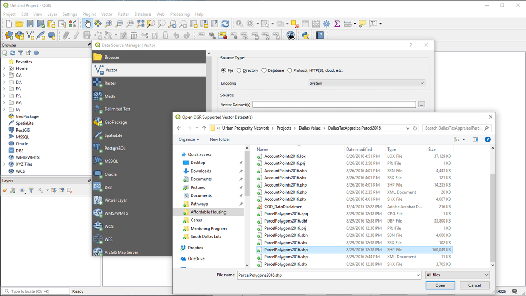
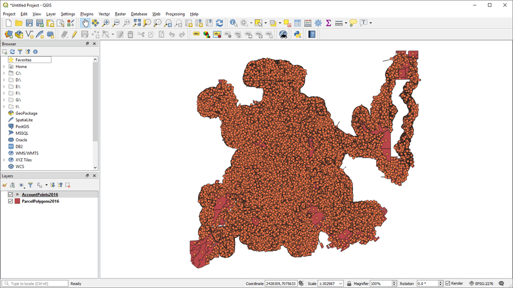
If your appraisal data is in a shapefile like mine, repeat the process. Otherwise click Close and follow the tutorial above to join the data table which is most likely in a CSV file. Depending on the city size, you may or may not want to add a street layer for reference. Dallas is huge, so I won’t do that here. You should have something like this in the shape of your city:
Examine Your Data
The easiest way to look at your data is to look at the column descriptions document. In mine, I see that I’ll need CityTaxVal which is the city taxable value found in the points layer and AREA_FEET which is the square footage of the parcel.
I also notice that there is a column for tax exemption, TOTEXEMPT, which will be indicated with an X. Maybe we can use that later.
Now that I’m looking at it, I realize I made a mistake. The AREA_FEET column is not in either of the layers I’ve loaded so far. Going back to my folder I see I also downloaded a zip file called DallasParcel2016. I extract, drag and drop, and see that now, I have the column I wanted.
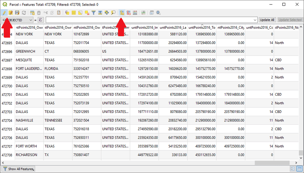
The way to check whether you have the columns you need is to left click the layer in the Layers box. Then select Open Attribute Table. You’ll get a table in a new window that shows the columns, rows, and values of the layer.
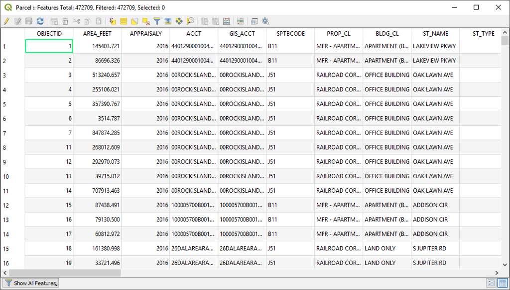
What I also see here is that I have 472,709 features. Make sure to save your work often in case working with larger layers crashes QGIS.
Merging Data
Since my value is in a different layer than my area, I’ll need to put them into a single layer. Basically, I’ll join the points to the parcels so that I can divide the value by the area.
Check to see what value you will join on. Looking at my columns document (or you can look at the attribute table), I see I have AccountID in the points layer and ACCT in the parcels layer. Both those values should be the tax account number which should be unique.
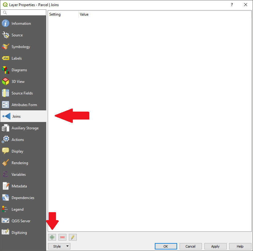
Right-click your parcel layer and select Properties. About halfway down the left menu bar, you’ll see Joins. Select that. At the bottom, you’ll see a green plus sign. Click that.
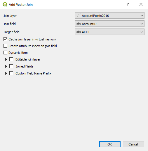
On the Add Vector Join dialogue box, the Join Layer should be populated with the layer you selected to get here. The Join field should be the column from that layer to join on. The target field should be the column from the layer you want to join to it. Click Okay.
After a few seconds, you should be back at the Layer Properties dialogue with the Join Layer showing on the top. If you click the caret arrow next to it, you will see the details.
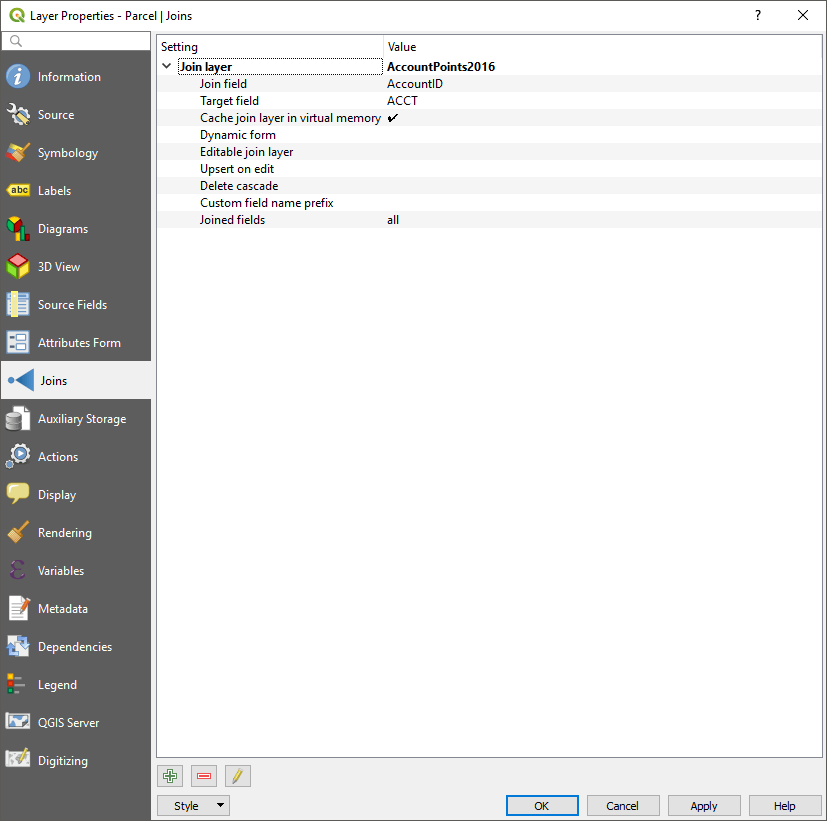
Click okay and QGIS will redraw the map to include the joined data. Confirm it by checking the attribute table for the layer you joined. The new columns will be prepended by the name of the other layer and start after that layer’s columns. The new column I’m interested in is now called AccountPoints2016_CityTaxVal.
Calculating Value Per Acre
I’m going to need to calculate the actual income the city receives from each parcel. Right now, I just have the city taxable value. I need to search and find the city’s tax rate. I find mine on the same county appraisal district. The City of Dallas charges 0.7825 percent times the taxable value.
On the same page, I see Maintenance & Operations (M&O) and Interest & Sinking Fund (I&S) Tax Rates. I don’t know what that is, but if someone thinks that’s important, please let me know in the comments.
If you don’t have it open, open the attribute table for the merged layer (right-click it). To create a new field, you need to click the pencil icon at the far left of the menu. That’s to toggle editing. Then click the icon that looks like a table with a yellow bar and star on it about two-thirds of the way over to open the add field dialog.
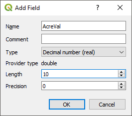
I’m naming mine AcreVal, changed the Type to Decimal number (real), and Length to 10.
Next, we need to fill the values of AcreVal. Click the Icon that looks like an abacus in the attribute table menu. On mine, it’s fourth from the right called Open field calculator.
Here you see we could have used this directly to create a new column (i.e. Create a new field). Since we already created it, check the box “Update existing field”. Below that checkbox, use the drop-down menu to select AcreVal.
In the Expression box, we want to write the formula to calculate value per acre. We will need the names of the columns so to the right, we have a window listing different tools and values. Click the item called “Fields and Values” so we can easily get the columns we need.
The formula generally is:
City Revenue / Acreage
We further break that down to:
(City Assessed Value * City Tax Rate) / (Square feet of parcel / 43,560)
That value will be in units of dollars per acre.
My expression will be:
(“AccountPoints2016_CityTaxVal” * 0.007825) / (“AREA_FEET” / 43560)
Yours will be different based on the fields you are using. You can either type them out or double-click them from the “Fields and Values” list if you remember which columns have the values you need.
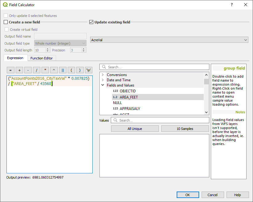
Click OK and QGIS will calculate all your values. Confirm in the attribute table. Close the attribute table. If you have layers visible beside the main parcel layer, uncheck them now in the Layers window.
Create Different Layers
To get the nice red/green visualization, we’ll have to break up the layers into cash flow positive and negative layers. My preference for readability is to additionally break it up into zero income either because the parcel has negligible value or it’s tax exempt.
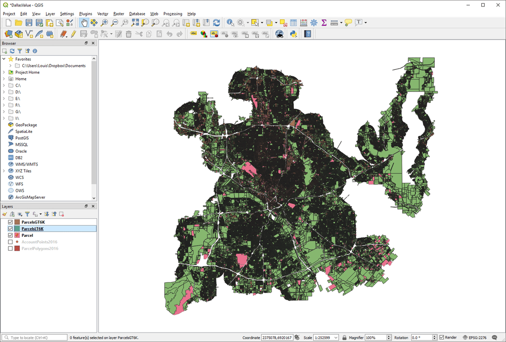
Dallas is so big that it is difficult to see it all at once. Even when I scale the window to fit my screen and set the parcel boundaries to 0.1 mm, I still have large patches of unreadable dark shading where the boundaries are too close together to be distinguishable. There are a couple of different ways to deal with that which we will get to.
According to Kevin Shepherd of Verdunity, a very (very) rough estimate we can use for the cost of city services per acre is $6,000. This is the calculation that Chuck Marone of Strong Towns says you can get 90% right with a guesstimate. The actual true figure is incalculable because it depends on too many factors including density, demographics, and the fact that city budgets are not developed on a per parcel basis.
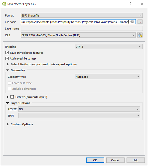
First, let’s make a layer for positive cashflow layers. About 2/3rds of the way over, select the icon that looks like a form on top of a yellow sticky note. Select “Select Features by Value.” Scroll down to AcreVal and type in 6000. To the right click the box that says “Exclude field” and change it to “Greater than (>)”. Click Select features. When it completes highlighting, click “Close.”
Right-click the Parcel layer in the Layers window. Go to Export > Save Selected Features As…. Under the format, select the second option, ESRI Shapefile. In the File name field, browse to make sure the path to your project is selected and name your layer. I’m naming mine ParcelsGT6K (i.e. greater than six thousand). Click OK.
Do the same thing with layers less than $6K. You may want to use less than or equal to in case you happen to have a parcel that came out to exactly $6K. Make sure you’ve clicked on the Parcels layer because the program will have selected the new layer we just created. When you’ve created your Less Than layer, click the Deselect Features from All Layers icon next to the one we just used.
Visualize the Layers
As you can see here, we still don’t have much to look at. I suggest you do any or all of these options:
- Visualize just the negative parcels
- Visualize just the positive parcels
- Visualize either as a gradient (more red or more green)
- Zoom in to specific areas where you can see all the parcels and visualize both gradients
- Visualize the whole city as a heat map
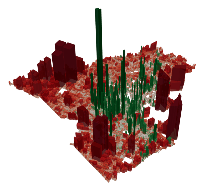
If you noticed, I did not suggest you visualize the city in 3D. That’s for several reasons such as how volume distorts the value, that extruding parcels that have already been color-coded don’t add any new information, and that variations in parcel size further distort the values. It’s for similar reasons that pie charts are not used very often when precision matters. That said, it’s possible that a 3D chart might provoke a stronger emotional reaction if that is what you’re going for.
Let’s start with the negative cash flow parcels. Since some of the parcels won’t be visualized here, let’s customize the original parcel layer to use as a background.
Double click your original parcel layer in the Layers window. In the left menu, click on the 3rd item which is Symbology. At the top, there should be two nested boxes that say Fill and Simple fill. Click the latter. Change the fill color to a light grey color. Change the Stroke width to 0.1. Click okay. Make sure you have the layer turned on too.
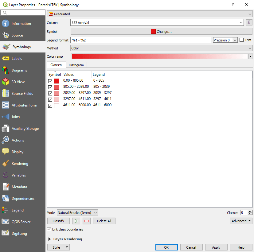
Double click your less than parcel layer. At the top above the Fill and Simple fill box, click the line that says, “Single symbol” and select “Graduated”. Under Column, select AcreVal.
The Color ramp we want goes from dark red to white. The easiest way to get it is to click the Symbol field where it probably has a colored box and says “Change…”. Select a red fill in that menu. Your color ramp should now be. If not, click the color ramp somewhere in the middle and change the colors manually. It may have defaulted to white to red. If so, click the down arrow on the right side and select “Invert Colors” so you have red to white.
There is a blank window under the Classes tab. The default mode is equal intervals. If you want to use that, click the Classify button to see where the breaks are. Personally, I like Natural Breaks better because it groups them according to “natural” cluster break points. It takes a good amount of computation if you’re running a large dataset. If you have a slow computer, you may want to stick with Equal Interval. Save your work before you do it.
If you want to see what your data distribution looks like and the breaks according to different modes, change the mode under the classes window and then click the histogram tab next to the classes tab. Make sure you click to load the values.
I would keep it at 5 classes. Any much more than that and it becomes difficult to read the map between so many different colors. When you have finished with your symbology settings, click OK.
Repeat the steps above for the greater than 6K layer. The problem I ran into now and before is that when I classify the data for these larger values, it turns out we see the imperfections in the GIS process. See what I get when I do equal intervals:
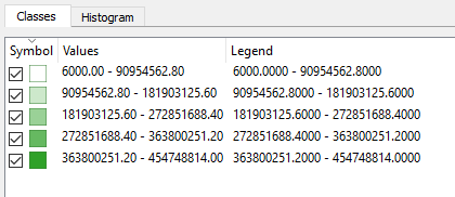
My first class ranges from $6,000 to $90,954,562.80. That means 80% of my range is above $91M/acre. Since we know that’s not what we want, let’s look at the data. My histogram just looks like a vertical line at $6K and a horizontal line to the right. Let’s open the attribute table and take a look.
Inside your attribute table, right-click the AcreVal column header and select Sort. Click okay. It’s sorted ascending so I see a lot of 6000 values initially. Halfway through my table, I see values around 10,000 which seems fine. When I get to the bottom, I see the problem. My highest value is 454,748,814. The square feet for that parcel is 6.7.
One problem with GIS record keeping is artifacts like this. We are not interested in leftover slithers that are basically just mistakes from drawing the parcels. The top highest AcreVal values are all less than 20 square feet.
Most likely, nothing we are interested in will be less than 100 square feet. They are most likely mistakes we don’t want to visualize. They won’t show up on the map because they’re too small but they will skew the data even if we do natural breaks.
What I will do is to do the select by value process we did before to create a new greater than layer that excludes parcels less than 100 square feet. The way to do that again is to select by value and then export the selected parcels to a new layer. I’m naming my new layer ParcelsGT6K100.
After doing that I went from 164,374 parcels to 164,351. So I removed 23 parcels that were probably mistakes. Now my histogram looks like a logarithmic curve where I have lots of lower values and a few higher.
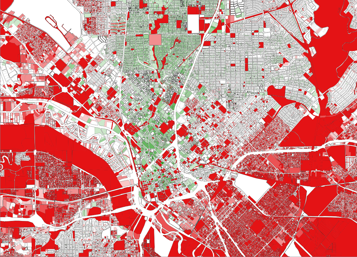
When I turn on both the greater than and less than value layers, all I see is red and some grey:
The grey is the borders of the parcels that are too small to see. Even with the smallest border, it still turns large areas grey. If you go back to symbology and set the opacity of the border stroke line to zero, then you only see the fill colors.
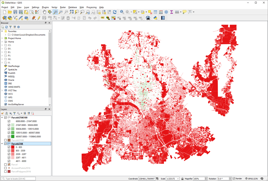
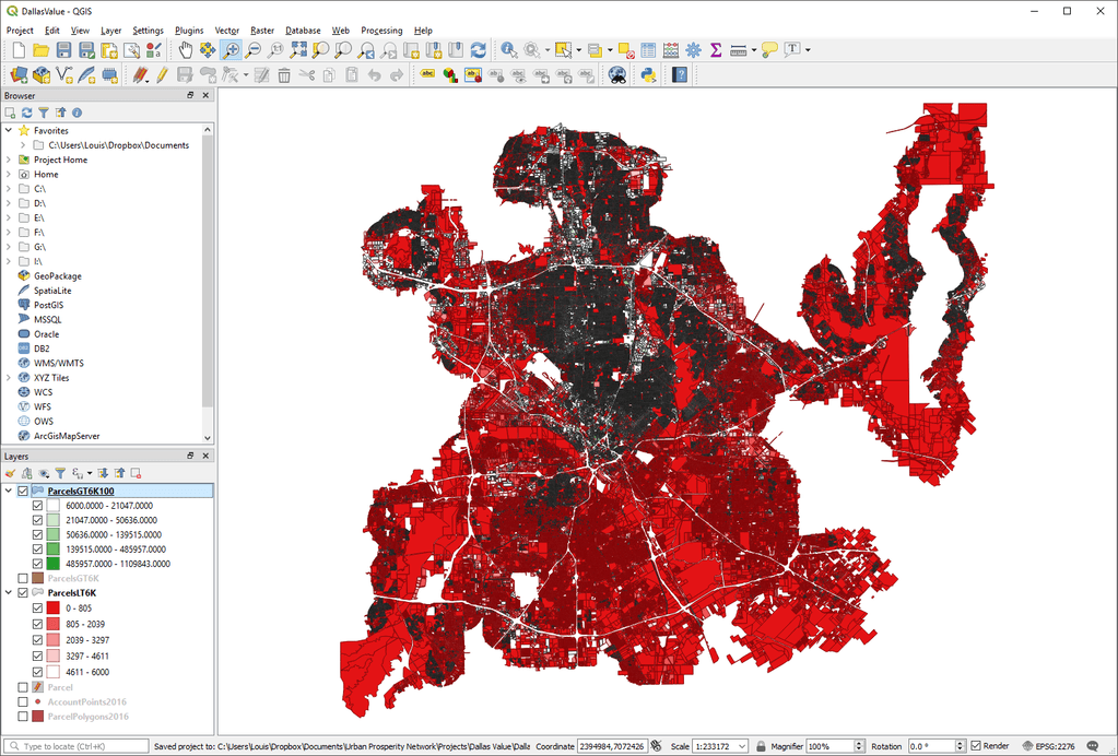
At least now we can see that there is some green on the map. If you don’t know Dallas, it’s there located in the downtown core and the nicer Uptown areas. That’s why I recommended zooming in. Let’s do that now and turn the background parcels layer back on.
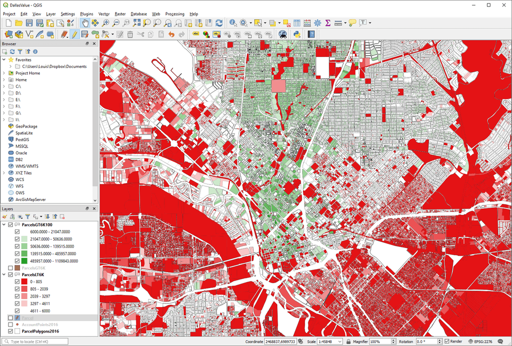
Remember this is just a view of the cash flow status. White parcels are at or near breakeven. The city is losing money on red and making money on green. Obviously, the story is more complicated than that but if you look at the city as a whole, that’s generally the conclusion you can draw.
If you saw in the previous image, there is a fat red river looking set of parcels that seem to wrap south of downtown. That’s not the river. I clicked on it with the Identify Features tool and found it’s industrially zoned land in the floodplain next to the river.
The story that was told about the cheap, older stuff being valuable to the city as it is in Lafayette, doesn’t seem to hold true for Dallas.
Due to factors outside the scope of this exercise such as de facto redlining, racism, disinvestment, etc., all the economically productive land is downtown and north within the corridor created by highways US 75 and the Dallas North Tollway. Small parcels east, south and west all cost more than they take in. Additionally, those areas are generally known to be higher crime areas, so these proportions may be skewed even further in actuality.
The white pocket of breakeven areas to the southwest is Bishop Arts which is rapidly gentrifying. Even with the rapid gentrification, we still see here that we’re only at breakeven.
If we tried to visualize this in 3D, we would have a few green needles inside a pool of red. That said, if you still want to do 3D, there are plenty of tutorials on that for QGIS.
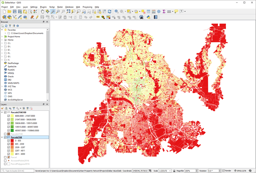
The only other change I might suggest is changing the color ramp from breakeven being white to another color such as yellow, so those parcels stand out from the white background. If we do that, we get this:
That’s how to visualize value in your city using free tools. Hopefully, it wasn’t too painful. If you can think of any improvements to my explanation, please feel free to comment or email me.
Leave a Reply