As a fun side project, I decided to write some code to realign my Toastmasters district. I’m also on the realignment committee so the project will hopefully get some real-world use.
For reference, I’ve posted the code here on GitHub: https://github.com/LouisRBurns/Toastmasters_district_realignment
The technical details for implementing it are there. Here, I wanted to reflect on the process and the decisions I made in developing the code.
Problem Overview
A Toastmasters district is made up of clubs inside areas inside divisions inside the district. Each level is allowed to have 4-6 elements (i.e. ideally 5 clubs per area). An ideal 200 club district would have 40 areas and 8 districts then.
This year’s alignment in particular would be challenging to draw manually because so many clubs folded during the pandemic. We ended up with many areas with 2 or 3 clubs in them. Those make for challenging contests because you’re required to have a certain number of participants and judges even if there are only two contestants. It’s a strain on already weakened clubs and district leadership.
As I’ve written here previously, I’m somewhat familiar with the gerrymandering literature as well as computational districting. I’d decided I wanted to learn more by actually implementing a solution.
Initial Approach
I’d heard districting could be done with a genetic algorithm. I found and skimmed through a book on grouping genetic algorithms. I followed a free Udemy course on them. I read part of a book on implementing them in Python.
It took me a while, but I eventually recognized that the problem was most like the Vehicle Routing Problem which is a special case of the Traveling Salesman Problem in which someone needs to find the shortest route to visit a number of cities. In this case, we wanted geographic proximity for the areas which could be optimized by minimizing the distance between them.
I initially created a complicated quality score since in theory you want balanced areas with some strong and some weak clubs – not all strong or all weak. In practice, we don’t have a good way to determine that. Traditionally, we would rely on how well they did in the Distinguished Club Program and perhaps their overall membership numbers.
In my quality score, I was comparing their number of awards per member (i.e. participation), their retention (new members to renewals), and total club size. For club size, bigger is not always better. After around 25 members, not everyone can participate in the meetings and an argument could be made that the quality starts to degrade. So I made the quality based on how close they were to 25 rather than a total count.
My quality scores were normalized to a final output of 0 to 1 with 1 being the highest. I played around with some hypothetical scenarios and found that if you evenly spread 5 clubs as weak, medium, strong, you would end up with a standard deviation of about 0.35. A standard deviation of zero would mean there is no spread and all the clubs were the same. A standard deviation of 0.5 would mean you had equal numbers of the absolute highest and lowest quality scores.
Genetic algorithms essentially work by starting with random configurations, crossing them, occasionally mutating them, and keeping the best ones in each generation. It picks the best ones from the fitness function you give it – whether to minimize or maximize a certain number.
I started trying to maximize compactness and minimize the quality deviation from 0.35. I figured compactness would be the most relevant spatial metric to use in thinking about districting programs.
Algorithm Performance
It didn’t go well and the algorithm didn’t converge as you can see in Figure 1. The red line is the maximum compactness. The green is the average. While it’s good that we see it going up, the bouncy red line means it’s not converging – finding an optimal solution. The red/green line at the bottom was the quality distribution. I never got it to move so in future tests, I took it out.
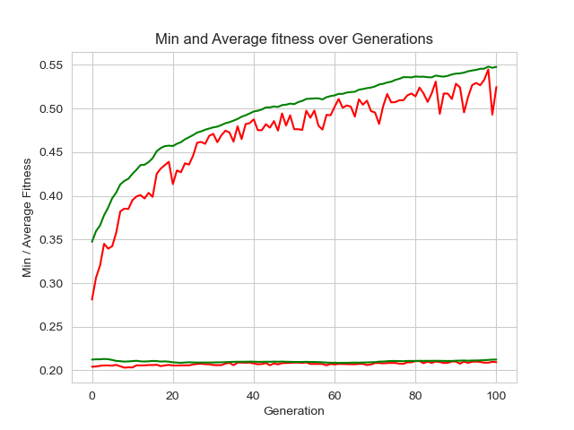
You may think that’s not so bad. It’s still going up. While that’s true, when I plotted out the maps, the areas were all over the place stretching the entire distance from east to west about 200 miles from Dallas to Shreveport, LA. They weren’t useable plans at all.
At first, I thought perhaps a genetic algorithm couldn’t solve this problem. So I took a long detour into looking at the Markov Chain Monte Carlo used to analyze districting plans. In short, that starts with an initial state and changes it – not necessarily for the better – over and over. You end up with a lot of plans you can look at aggregate metrics on. It’s great for analyzing an existing plan but terrible at coming up with the best one.
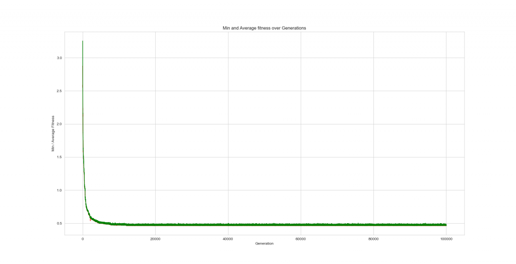
Then it dawned on me what compactness is. I should have realized it when I was writing the fitness function but eventually, I figured out that it’s a ratio of “roundness”. It doesn’t look at the size which is what I really wanted to minimize. When I changed the fitness function to minimize the distance between them, it worked as expected. Plus, it ran a lot faster without compactness and quality metrics.
As seen in Figure 2 below, I found that I kept getting improvements out to almost 15k generations. This image of 100k generations only took about 20 minutes to run on my laptop.
Encoding Details
In the Vehicle Routing Problem, you give each location a number and add numbers for the number of routes you want to act as separators. So if you had 10 locations and 3 routes, you would have 12 numbers so numbers 11 and 12 would make 3 divisions of the number sequence. The issue with that approach is that you don’t have a set number of locations in any one route.
For a Toastmasters district, I wanted 5 clubs per area and 5 areas per division with however many divisions that added up to. So I wrote a grouping script that would check the length and use the correct grouping function to make sure you always had the most 5-club areas and the rest as 4-club areas.
It’s possible to set the number of elements to be a constraint you enforce or optimize for. From the documentation, I wasn’t seeing exactly how to do that. Plus, my fitness function had to do this grouping operation anyway so I figured it would be easier to enforce area size in the encoding rather than the optimization.
The academic book on grouping genetic algorithms said you need to keep the groups together but didn’t provide any details on actually implementing the code. If I were going to spend more time on refining this code, I would next try a more group-centric crossover function.
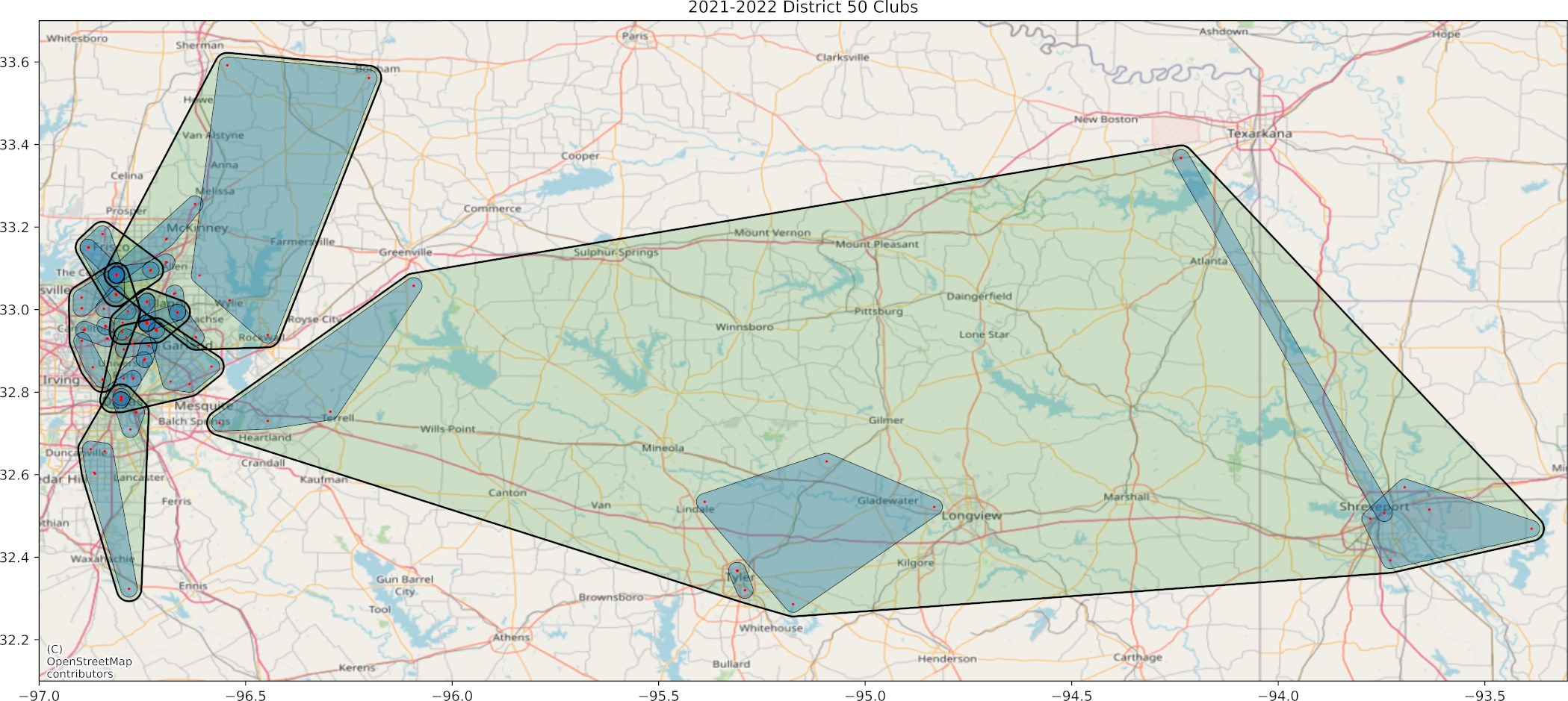
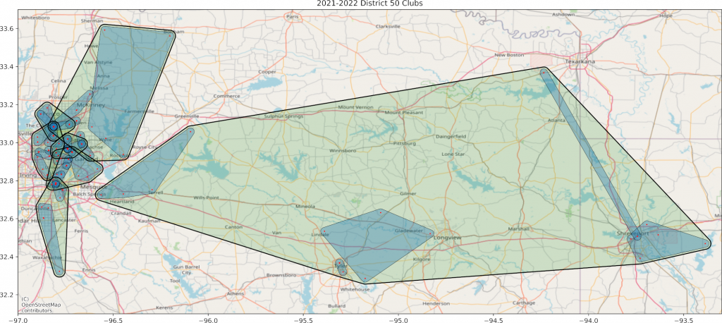
The one problem with encoding the way I did means the crossover function doesn’t always mix the clubs at the very end of the sequence. When I mapped the best area result I got Figure 3. Notice the northeastern part. There is some overlap up near Texarkana.
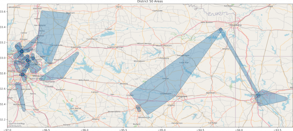
I found that the area stretching between Texarkana and Shreveport was one of the two 4-club areas. I switched a single club over and got the result you see in Figure 4. This one includes the divisions. Areas are blue and divisions are green.
Discussion
As you can see, you need to manually inspect the plan to see whether there are any easy fixes. If you can swap out clubs in adjacent or overlapping areas, you might bring clubs closer together. Incidentally, these club locations are mapped by jittered zip codes.
To clarify, the genetic algorithm is run twice – once to group clubs, and once to group areas. The algorithm exports its best result as an internally read pickle file, a shapefile for visualizing in a GIS like QGIS, and a csv for viewing in Excel.
This particular map is missing about 25% of the clubs because I either didn’t have their zip code or they were new and didn’t have quality metrics. When we do this for real, we’ll manually fix any missing data.
In looking at our current state with 2 and 3 club areas, I realized that our knowledge of which clubs will disband won’t be perfect. My current thinking is that we need to discuss a threshold for what constitutes a club expected to disband. Obviously if they have zero members they’re disbanding. But what if they have 5 (8 are required to continue)?
I’m thinking we should run the algorithm initially without the clubs that are expected to disband and with the clubs that are expected to charter within the next few months. Then with mostly 5-club areas, we can add the disbanding clubs and they won’t hurt the area strength once they’re gone.
Other Learnings
Coming from a data science and GIS background, I found I had to upskill in a few areas to be able to implement this algorithm. Here are some general and specific things I learned.
I was used to developing code in Jupyter Lab so I can see what I’m doing at each step. The DEAP library probably could be run in a notebook but it’s not set up that way. I ran the script as a script the first time and nothing happened. I spent a lot of time debugging until I realized the DEAP library worked on object oriented programming principles and I would need to pass parameters to it that fit that paradigm.
I had to go brush up on my object oriented programming skills and syntax. DataCamp was good for that. Then I realized if I ran a script, it would be difficult to debug from the errors that could be anywhere in the script. I realized I would need to use unit testing so I could test each function as I went. DataCamp had a course on that too and I read some Medium articles too.
I wasn’t sure when my algorithm failed to converge initially whether it was due to the crossover function or not. I ended up reading a bunch of academic articles on crossover and genetic algorithms to straighten it out.
In thinking about the lack of convergence on quality, I was reading articles about gerrymandering, MCMC, and the unintended consequences of majority-minority districts. We’ve have some sense since the 90s that the requirement to draw minority districts so voters can get a candidate of their choice actually gives them less representation when it comes to the controlling branches. I can discuss that in more detail if anyone’s interested. Especially in the pandemic era, it doesn’t make a lot of sense to try very hard to figure out who the weak and strong clubs are as long as they’re continuing.
In working with the MCMC algorithms, I learned a lot about graphs and the networkx library. I’m still interested in the applications of network science to urbanism (as per our namesake) so I found that valuable even though I didn’t end up using it for this project. I’m still fascinated by the relationship between a location-based approach and a relationship-based approach.
Overall, it was a good project. There were moments when I couldn’t see the light at the end of the tunnel but now it’s done. My next project is writing a chapter in a forthcoming book on smart cities and finance.
Leave a Reply